
Indices of Multiple Deprivation: how to explore the data in your area

Guest blogger Lucy Smith, Social Research and Data Lead at London Plus, explains what the Indices of Multiple Deprivation are, busts the jargon and gives a short Excel tutorial on how to explore them for your area. This is part of our Datawise London series.
The Indices of Multiple Deprivation (IMD2019) are the official measure of relative deprivation in England and can be used to explore levels of deprivation in your neighbourhood, across London and beyond.
In addition to this, users of the IMD can also see how their borough performed against the seven distinct domains of deprivation (DoD): income, employment, education, health, crime, barriers to housing and services and living environment.
Whilst this might seem a lot of information, organisations shouldn’t be put off by the IMD. This data is a powerful resource and has a lot to offer those who are willing to learn.
In this article, I’ll help you get to grips with the IMD. We’ll cover a few key points including:
- What are the IMD? And how can I view them?
- A short Excel tutorial demonstrating how to access the data and explore the IMD in your area
- And finally, some tips for interpreting and working with IMD data resources
What are the IMD? And how can I view them?
The IMD are set of descriptive statistics which are published by the Office for National Statistics every 3-4 years. In the report, areas are scored and ranked based on an aggregate calculation of 39 separate indicators of deprivation, which are then weighted against one another into seven distinct categories known as the domains of deprivation.
The really great thing about the IMD is that this data has already been processed and cleaned for its users. Users can measure relative deprivation in their area with the following tools:
Average rank
The average rank is a holistic measure which is allocated to an area based on both its performance (score) and how this performance compares to other areas on a national scale. The current ranking system ranges from 1 to 32,844, with 1 being the most deprived and 32,844 being the least deprived, respectively.
Average Score
The average score is an aggregated mark which is calculated using an area’s individual scores across the seven DoDs.
Individual scores for each of the seven Domains of Deprivation (DoD)
- Income
- Employment
- Education
- Health
- Crime
- Barriers to housing and services
- Living environment
If you’re looking to target a specific issue in your area, the DoD can help. These scores are calculated using 39 separate indicators, which are then processed by ONS statisticians to generate a score and a rank for each of the DoD.
How can I view the IMD?
To view all of this information, as well as how your area has performed across the seven distinct domains of deprivation (DoD), the ONS have developed a free, online mapping tool (the IMD2019 Explorer) which can be accessed here.
To see how your neighbourhood performed, simply search for your postcode. This should automatically generate information about your area, including its performance across the DoD.
The IMD2019 explorer can also be used to view trends nationally and in your area by clicking on the highlighted areas of the map. These trends can also be compared against the IMD2015 data using the tool. A screenshot of what the tool looks like is featured below:
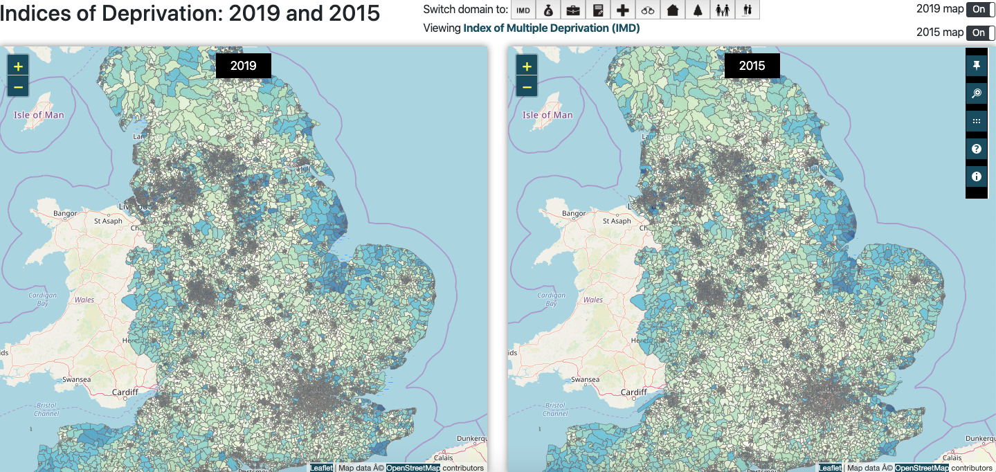
At a first glance, you might be tempted to stick with the mapping tool. But this tool is designed to only do so much. If you want to generate some descriptive statistics about your area, like bar graphs, or compare trends in your region, then you will need to download the dataset.
But fear not.
If you have spreadsheet software like Excel or Numbers, downloading and manipulating this data is relatively straightforward.
In the next section, I’ll give you a few tips about how you can manipulate the data to gain insight and generate handy materials which can be used in presentations, reports, newsletters, social media communications and so on.
The really great thing about the IMD is that most of the laborious maths has already been done for you, so the possibilities for stress-free tinkering are endless!
How to access the data
To get started, you’ll first need to download the IMD data. You can do this by accessing the IMD2019 webpage on the Government’s website. Once you’ve done this, scroll down to the publication’s list and select English Indices of Deprivation 2019.
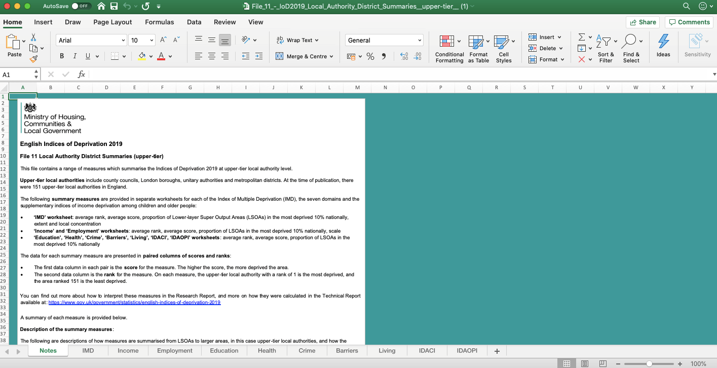
You’ll then be directed to a page of resources which includes reports, infographics, a user guide and the datasets. Feel free to browse the literature at your leisure. You don’t need to read it all but I found the infographic and frequently asked questions both really useful.
The statistical report is also a fascinating read and is full to the brim with headline stats. This can be a valuable resource if you’re looking for information about relative deprivation at the national level. Scroll down to file 11, Select and Download.
Once you’ve downloaded the file you’ll need to open it up in spreadsheet software. I’m using Microsoft Excel for this demonstration, so these instructions might not work with equivalent software (i.e Mac Numbers), but the principles are the same and can be replicated.
Exploring the seven Domains of Deprivation in my area
Now that the database is open, we can begin manipulating the data. It should be noted that I’ve chosen this file because it explores output at the upper tier authority level i.e boroughs and constituencies.
If you’re looking for a postcode/district within a borough, you should download file 10.
The database will have several worksheets at the bottom. This includes the IMD average score and rank, as well as each of the seven domains of deprivation which are labelled accordingly i.e income, living environment.
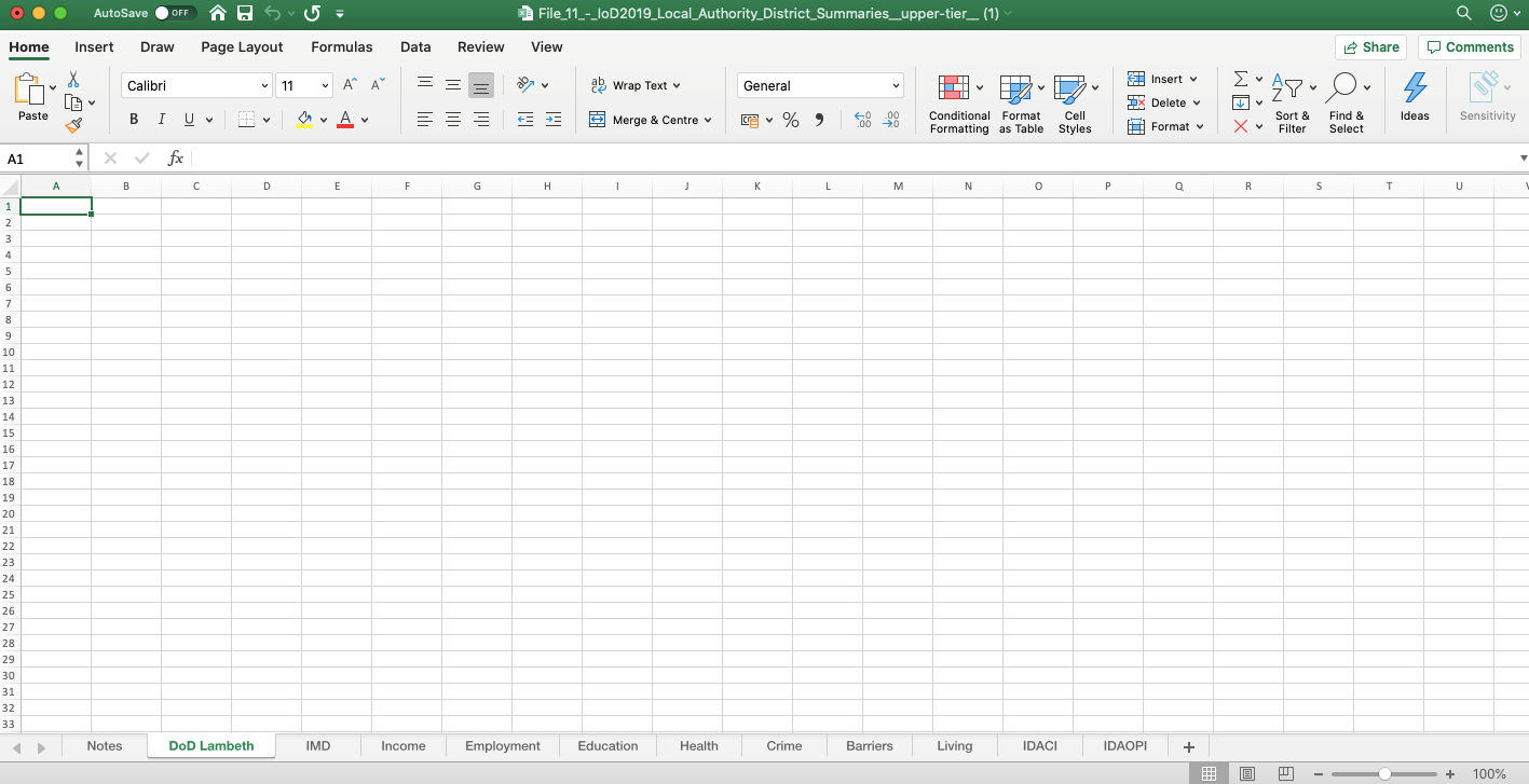
Click the + tab to create a new worksheet.
Once you’ve done this, right click on the worksheet tab and rename the new worksheet.
In this demonstration, my worksheet is called “DoD Lambeth”. This refers to the seven domains of deprivation and the borough I’m going to explore.

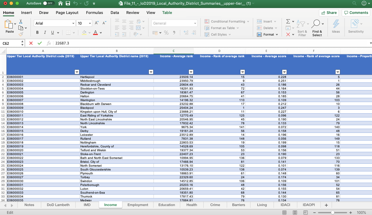
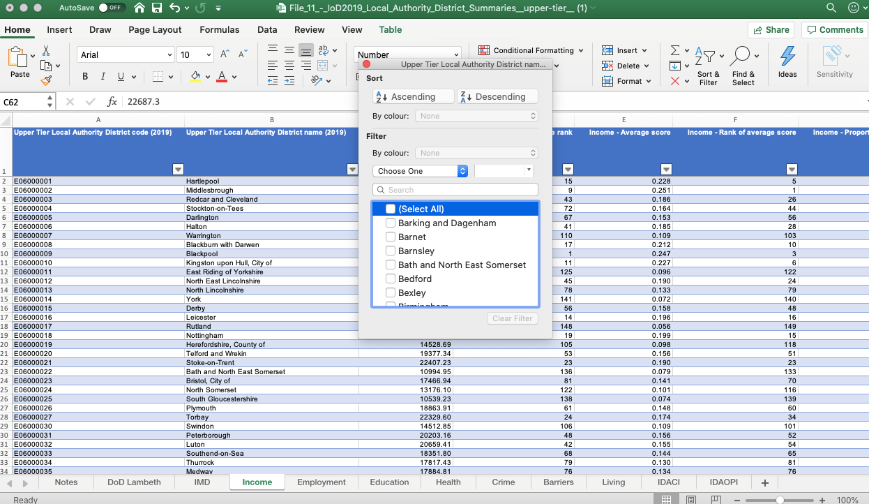
Before I can build my table, I need to filter the data accordingly.
To filter the data, select a cell and press command T. Click OK.
This will automatically convert the dataset into a table format, which makes it easier to filter through the data.
I’ve decided to begin with the Income worksheet.
Scroll to the top of the spreadsheet.
Select the Local Authority District name (2019) column and then press the filter button.
In the pop up box, deselect “select all” and search for your area in the search box.
This will filter out all other areas and show the results for your area.
You’ll need to replicate this process across the other worksheets for each of the other domains.
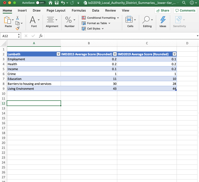
Once you’ve filtered the data accordingly, you can begin to build your table. In this demonstration, I’m using the average score because this data measures deprivation within the borough.
For the sake of generating a “clean” bar graph, I’ve also rounded this data to either the nearest integer or nearest decimal place.
Select any cell within your data and press command T to generate a table.
Select the insert tab and scroll across to charts.
Select the bar chart icon.
You’ll now be given the choice of several different bar chart styles.
In this demonstration I’ve chosen the design below. Select the style you prefer. This will insert a blank graph into the worksheet.
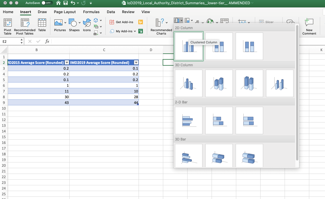
Drag and drop to position your bar graph.
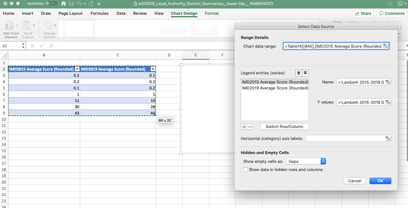
Then scroll up to the Chart Design ribbon and click data.
This will generate a pop-up box. Go to the series box and select +.
Then highlight your table and select ok or press enter.
This should then generate a bar graph like the one pictured below, which explores the seven different DoD scores across your borough.
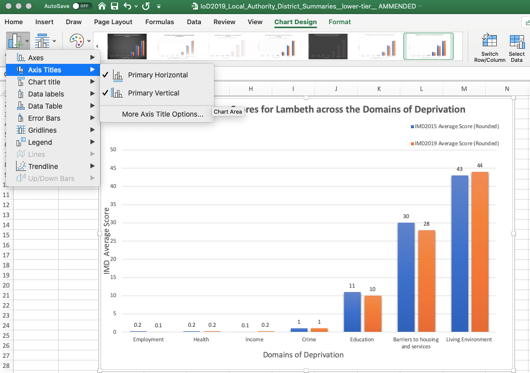
It should be noted that I’ve added my own titles and axes labels to this bar graph.
To add titles and axes labels, go to the Chart Design ribbon and select add chart element.
Here you can add titles and labels by selecting the options and imputing your text.
You can also change the font and size but right clicking on the text box and selecting font.
The IMD2015 are also available online and are a useful comparative resource. You can repeat the same process to generate two separate bar graphs for comparison.
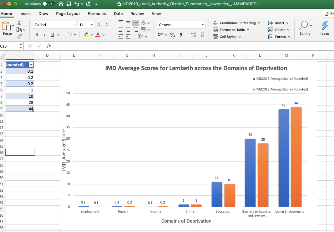
If you want both sets of data in the same graph, simply add another column in your table and input the data. This should generate a bar graph like the one featured below.
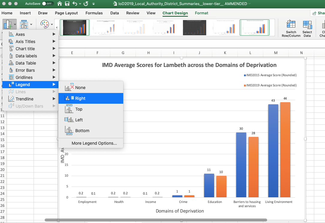
After you’ve done this, select the “add chart element” button and select “add legend”.
This will enable you to add a key i.e orange = 2015 IMD data, blue = 2019 IMD data.
Here is the finished chart and table, which can be copied into reports, presentations (including PowerPoint) and social media:
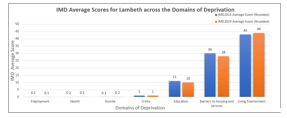
|
Lambeth |
IMD2015 Average Score (Rounded) |
IMD2019 Average Score (Rounded) |
|
Employment |
0.2 |
0.1 |
|
Health |
0.2 |
0.2 |
|
Income |
0.1 |
0.2 |
|
Crime |
1 |
1 |
|
Education |
11 |
10 |
|
Barriers to housing and services |
30 |
28 |
|
Living Environment |
43 |
44 |
Tips for interpreting and working with IMD data resources
Whilst the IMD are a really useful resource, they can only be used and interpreted in certain ways.
Guidance is available online, including some frequently asked questions.
The general guidelines for interpreting the IMD are as follows:
You can…
- Compare your neighbourhood to other areas across England. The IMD has been designed to act as a comparative tool.
- Use the IMD to identify the most deprived areas nationally, regionally and locally. The general rule is the higher an area’s score and the lower it’s rank on the scale (i.e 1st, 2nd, 3rd) the more deprived an area is.
- Explore domains (types) of deprivation in your neighbourhood and beyond.
- Comparing districts in your area to one another. You can compare postcodes, as well as larger administrative areas such as local authorities.
- Look at changes in relative deprivation between iterations i.e changes in rank.
You can’t…
- Quantify how deprived your neighbourhood is.
Defining and measuring deprivation is a complex methodological problem. There is no consensus about which type of measures or data are best, so the IMD data cannot be taken as a definitive resource i.e “[name here] is the poorest area in the country” should be rephrased to “The IMD have identified [name here] as the poorest area in the country based on calculation of [x, y and z] factors…”
- Identify deprived people.
The IMD cannot be used to identify deprived groups because it is not fair to say that all residents of a deprived area can classed as relatively deprived. Most areas will have deprived districts and residents, as well as affluent districts and residents.
For these reasons, the IMD can only be used to identify deprivation across space and not amongst populations.
- Measuring affluence i.e how wealthy an area is.
The IMD rank and scores are calculated using deprivation measures. These measures cannot be used to ascertain wealth. If an area is performing well and you suspect that this area might be affluent, you should consult other sources which actively measure wealth/affluence.
- Compare areas across the United Kingdom.
English data cannot be compared to Scottish data, and vice versa. Although these datasets may use the same measures and types of data, they are calculated within a specific jurisdiction i.e Scotland, Wales, Northern Ireland. This means that each has been treated as an individual dataset.
Variations and skews within each dataset have not been controlled for, which means you cannot compare areas as like for like.
- Measure absolute change in deprivation over time.
Critical thinking is crucial
The best way to use a data resource like the IMD is to think critically about the information you are being given. That is to say, it’s best to remain open to other possibilities. Do not take the IMD data as a source of “hard” facts.
Quantifying social phenomena is a deeply complex methodological process. Very rarely does one resource capture and represent all activity.
Instead, the IMD should be used as a measuring and comparative tool, which is exactly what this data has been designed to do.
Do not try to use this data for things beyond its purposes. If you are facing a complex data challenge, or have “gaps” in your data which haven’t been sufficiently addressed by the IMD, look elsewhere for complimentary resources.
Your organisation’s own data and local knowledge, other reports, policy documents, academic publications and quality news articles are all other resources which can be used in conjunction to the IMD when tackling data challenges.
Don’t be afraid to use lots of sources to follow a hunch- speaking from experience, the best research always uses a variety of resources.
Next steps
For enquiries about the article or London Plus, contact lucy@londonplus.org
If you need help making sense of the IMD for your area please get in touch with us at Superhighways.
Our Datawise London programme of training and advice can help. Please also sign up to our e-news to be kept informed of future free and affordable training sessions, including how to manipulate and analyse data using Excel.
References
Singaporean Ministry of Manpower., (2013) ‘Absolute vs Relative Change’, mom.gov.sg [Online].
Wikipedia., (2019) ‘Relative Deprivation’, Wikipedia.org [Online].
Stay in touch
If you would like to receive news and updates about training, tech tips, resources and opportunities for small charities and community groups in London please sign up to our mailing list.