Full recording of 'Exploring the 2025 Indices of Deprivation data for London' event.
In October 2025, the Ministry of Housing, Communities and Local Government (MHCLG) released the new Indices of Deprivation (IoD) data.
We organised an event in January 2026 to raise awareness of this updated dataset for London’s small charities and community groups, collaborating with our friends at OCSI, Trust for London, DataKind UK and London Plus.
We wanted to share London insights and showcase some of the excellent online tools organisations can use to explore the data themselves.
There was huge interest from the sector with 100 bookings and 59 people attending on the day (with an additional 11 associates presenting and supporting the event).
Participants ranged from small grassroots organisations; small, medium and large charities; infrastructure organisations and local authorities, coming from 20 of London’s boroughs.
Event round up
Oxford Consultants for Social Inclusion (OCSI)
Oxford Consultants for Social Inclusion (OCSI) set the scene for us, explaining how the Indices of Deprivation were created and shared insights from the 2025 IoD data at a London level, highlighting what has changed between 2019 and 2025. See OCSI's event slides and their blogpost analysing the English Indices of Deprivation 2025.
OCSI also shared details of their IMD Explorer tool and their Indices on Demand Reporting Tool.
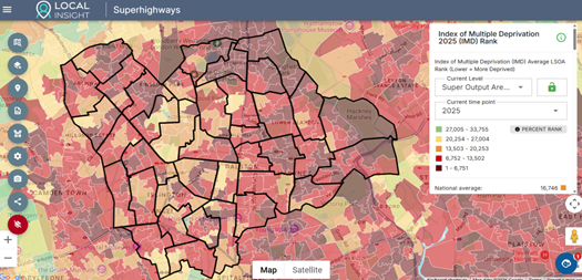
Superhighways has a license for OCSI’s Local Insight tool, incorporating hundreds of data indicators which can be overlayed on customised geographical areas. Get in touch for a 1:1 to look at this for your area.
Superhighways
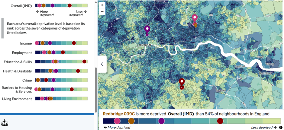
Superhighways then demonstrated how we can use the MHCLG’s mapping tool to compare several postcode datapoints and see the difference across the different sub-domains for income, employment, education, health & disability, crime, housing and services and the living environment.
WPI Economics
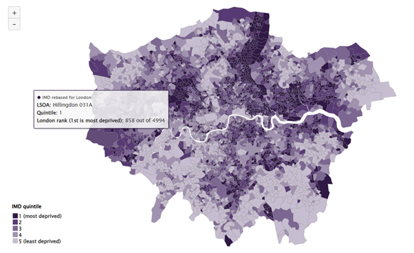
Guy Weir from WPI Economics then talked us through Trust for London’s rebased maps for London. These maps show LSOA data just from London (England LSOA’s having been removed) and so we just see rankings for the 4,994 London LSOA areas - really useful for comparing data just in a London context.
You can also look at maps for each of the seven sub-domains.
DataKind UK
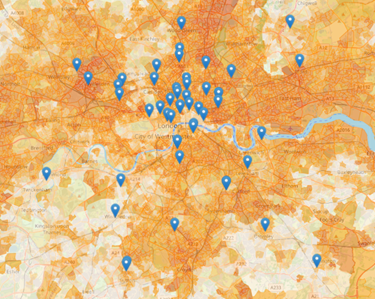
We then looked at the Community Lens tool developed by DataKind UK. This tool enables you to paste a list of postcodes and immediately see these mapped over the IoD data as a heat map. The more intense the colour, the higher the comparative deprivation.
The map below shows postcode data for event attendees!
Watch the full event recording here (or scroll back up to the top), with OCSI’s London insights and tool demos.
London Plus
Lastly, London Plus led us into group discussions to share what this data means for our work and the communities we support. We also discussed any surprises from the 2025 data or whether it reinforced what we knew already. Please see a round-up blog from London Plus.
What is next to explore?
We’ve scheduled a follow up event on 1st March for participants to delve into these tools further.
Participants were interested to understand more about the indicators behind the IoD - how they are weighted and what impact they have, as well as delving further into data for children and older people.
I have already grabbed all our families’ postcodes and put them into Community Lens to see how they map onto the data. I’m also in the process of making a request for it to feature income deprivation affecting children specifically, as that will be really impactful for us.
What participants said this event will help them do:
What have we done since?
I already used 2 of the tools to gather insights for our charity's funding bids and strategy.
Superhighways offered 1:1 sessions with participants, to explore data for individual organisations in Islington, Hackney and Lambeth. We looked at postcode data in the MHCLG map tool to compare the IoD data for specific geographic points. Being able to delve into data at such a very local level can unmask very localised pockets of deprivation.
We also looked at the organisation’s user postcodes in the Community Lens tool which gave an immediate insight into how far people were travelling to attend the service, as well as seeing deprivation levels for the areas in which people were living.
I actually did a demo of the Community Lens tool to my team during a meeting just now, and one or two of them are already hooked! Will be sharing with my CEO and wider SMT as well.
We were also able to compare 2019 to 2025 data for deprivation levels at a very local level to see change over time.
This is so, so helpful and fascinating. I will share it with my colleagues in our next meeting.
With one organisation we drew a custom boundary around specific LSOA areas and looked at the 2025 IoD data for this area in the Local Insight platform. We were able to screenshot visuals and download report data showing the data points for the custom area compared against borough-wide data, London-wide data and England-wide data.
See our useful tools for exploring IoD data resource with video demos.
What are the Indices of Deprivation?
The Indices of Deprivation (IoD) 2025 (also known as the Index of Multiple Deprivation, IMD) is the government's official way of understanding which neighbourhoods in England face the greatest challenges.
It combines 55 indicators across seven themes (income, employment, education, health, crime, housing and the local environment) to rank every neighbourhood from 1 (most deprived) to 33,755 (least deprived).
It's a relative measure, meaning it tells you how areas compare with each other but not the exact extent of deprivation. We can't use it to identify deprived individuals or measure absolute change over time, but we can use it to spot patterns and inequalities across the country.
Stay in touch
If you would like to receive news and updates about training, tech tips, resources and opportunities for small charities and community groups in London please sign up to our mailing list.


