
If you’ve been wondering where to start with the new Indices of Deprivation figures, you’re not alone. It is a lot to take in. So, we’ve gathered the essentials to help you cut through the noise.
Here are our top four resources to help you get to grips with the 2025 Indices of Deprivation and make the data more meaningful for your work.
If you’d like a bit more background beforehand, our round‑up blog walks through the key insights from our ‘Exploring the 2025 Indices of Deprivation Data’ event and explains why this matters for London’s voluntary and community sector.
Top 4 IoD resources
1. Indices of Multiple Deprivation Explorer
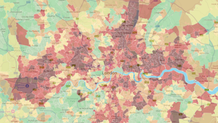
The IMD Explorer, created by Oxford Consultants for Social Inclusion (OCSI), is a free, easy‑to‑use mapping tool that helps you make sense of the 2025 Indices of Deprivation. It lets you zoom in on neighbourhoods across England, compare different areas at a glance, and spot patterns in local need.

2. MHCLG Mapping Tool
The Ministry for Housing, Communities and Local Government designed this mapping tool as a helpful starting point for charities and community groups who want a quick visual sense of where deprivation is highest, how different parts of their borough sit within national patterns, and which issues might need closer attention.

Watch our demo showing how to use the tool.
3. Rebased maps
The rebased IMD maps by Trust for London give you a focused view of deprivation by ranking only London’s neighbourhoods against each other. The deprivation data is split into quintiles, making it easier for charities to see where need is concentrated across the capital.

4. Community Lens
The Community Lens tool by DataKind UK lets you overlay your own postcode data onto the 2025 Indices of Multiple Deprivation, helping you quickly see how the communities you work with map against different levels of need.

Watch our demo showing how to use the tool.
Related resources
Stay in touch
If you would like to receive news and updates about training, tech tips, resources and opportunities for small charities and community groups in London please sign up to our mailing list.